Monday, May 19, 2014

The Lost "Works" of Andy Warhol - an Exercise in Quotation Marks

An interesting forensic project was completed late last year, culminating in the release of a documentary and exhibition this year at the Warhol Museum.  It involved the recovery of a number of items saved on Amiga 1000 discs by Andy Warhol.  A few of them had been thought to be lost, and the rest weren't even known until they were pulled off the discs and viewed.  When I say "interesting," I don't mean it in the sense that I believe these are newly-recovered works of genius.  Rather, I believe that this recovery has only further shown what a tremendous sham Warhol was, and that the public reaction to what has been found shows how fully modern society continues to hoodwink themselves into believing they've seen genius.

My interest was piqued by three of these files; a portrait of Debbie Harry (a perennial favorite subject of Warhol's), a detail from Botticelli's Venus Rising, and a pastiche of color that's more or less a self-portrait.

Debbie Harry's Portrait


Debbie Harry, courtesy Warhol Museum
This file was created on July 23rd, 1985 as part of a live demonstration of the capabilities of the then-just-released Amiga 1000.  Out of necessity (and wisdom) it was a fairly simple setup, consisting of the Amiga with a camera connected to it, and the software Graphicraft (or by some reports, its big brother ProPaint) loaded on the computer. During the demo, all that occurred to create this portrait was that a still frame was taken of Ms. Harry and transferred automatically into Graphicraft, where Warhol used a fill tool to create some color regions.

The entire process took about a minute, from capture, through fill, to completion.  There are many written accounts of this particular "work," as putative as the BBC and Salon, along with many others, with one word in common: Painting.  Even though I'm not a painter, I find the use of this word offensive for two reasons.  Obviously it wasn't physically painted, but that's not what really offends me.  First, and the more obvious, there weren't any strokes of color using the mouse, no shading technique, no practice of any drawing craft, indeed not a single action or thought that could even remotely be construed as painting of any kind. There are many fine artists working in the computer medium whose work could, even in 1985, be considered "painting." Their practiced techniques and use of the tools available are in complete harmony with the word, despite not using real paint.  I'm offended on their behalf. 

Second, because pressing the term "painted" into use implies a practiced skill that doesn't exist in this case, its evocation unnecessarily elevates a simple sequence of steps into the lofty world of fine art, and drags its alleged perpetrator along for the ride, into a realm he is unworthy of populating.  Continuing a charade that Warhol himself admitted to using, readers with only a passing familiarity with his work are haplessly deluded into thinking he was a painter.

A commentator during the Amiga unveiling proudly exclaimed that this type of thing had "never been done before."  Except perhaps by the programmer, who built the flood fill tool for precisely that purpose, and undoubtedly used it precisely as Warhol did hundreds of times in testing and recreation.


The Three-Eyed Venus


Warhol's Venus, courtesy Warhol Museum
Botticelli's Venus, detail, in common use
 At some point during his foray into the computer world, Warhol also saved an image of a detail of Botticelli's Venus.  This was another piece found during the digital excavation process, and indeed it had never before been seen, as exclaimed by the archaeologists.  (Skip ahead to the 14 minute mark.)  But even more interesting is the original of the image.  When I first saw it, prior to the release of the documentary, I immediately thought that he had scanned the image and done a simple copy and paste to get the extra eye.  But overlaying Warhol's file onto other scans of Venus only proved that scanning or photography were not the techniques used. Regardless of any scaling, skewing or warping, there was simply no way this was a scan, or even an off-axis photograph .  Wait just a minute - had I underestimated Warhol's talent after all?  Had he gone so far as to reinterpret the image in his own painting hand, making some of the hairs different colors, and mutating the scale in each axis, actually creating a new work?

No.  As was casually revealed in the above-referenced clip, Warhol simply took a piece of clipart from the existing Amiga library, copied and pasted an extra eye onto it, and is hailed as a genius and visionary.  Sure, he never released it, or even signed it, and that's to his credit, even though some of his works are unsigned.  The truly irksome facet of the entire exercise is the fashion in which the people viewing the file are so enamored by it.  All credit is given to the person who used someone else's image, without so much as a fleeting thought about the person who actually painted it in the first place for the clipart collection.  This is really the heart of the Warhol facade, as this same process is repeated over and over throughout his catalogue, giving praise to prints that are not only not one-of-a-kind works of art, but that are at their heart stolen from other people who took the time to create an image.  If an image is re-purposed or appropriated, that's part of art, and always has been.  But the process should be transformative, not imitative.  Taking an image and passing it off as your own creation, when all you've done is a slight and simple modification, is dishonest.

A quick aside here: United States copyright law has held interesting exceptions for works of art under the umbrella of fair use, as opposed to those items meant for mass consumption, such as a poster.  If a work is created that is either substantially similar to, or based substantially on, another work, then it is a copyright infringement, particularly if used for said mass consumption, and thus is not considered to be "fair use."  However, if only a single work is made, and is thus a work of art, then a blanket exception is often granted, since the market for the original would not be affected, unless it is reasonably indistinguishable from the original.  This partial reading of the concept of fair use is quite subject to the judge hearing the case, as in Cariou v. Prince, which was initially found in favor of the photographer whose work was appropriated.  Upon appeal, the Second Circuit found in favor of the artist who "borrowed" Cariou's photographs.  Cariou appealed, but was rejected.  As many artists have found, trying to blur these lines will land you in some legal trouble in the modern world.  Warhol wasn't particularly fond of one-of-a-kind originals, which he eschewed in favor of prints, each designed to be sold for a profit.  That makes his works of that type much more infringing than they would have been had he made only a single work of art from each one.

Self-Portrait


Andy Warhol, courtesy Warhol Museum
This file was also never released in Warhol's lifetime, though unlike the preceding two, it is signed.  I include this item as a juxtaposition to the previous two, because it displays an interesting curiosity and willingness to work with new ideas and textures, even if it is somewhat primitive.  The background texture fills also give an odd 3-d effect to Warhol's face, enhancing the power of the image.  To me, this is unquestionably the most important, and most interesting, work found in the Warhol Amiga archive.

Even at its most interesting, and most evocative of what Warhol would have tried to do with physical media if he could, this file is still primitive enough that it can only be considered noodling.  That's not an insult to this piece - Warhol was indeed noodling with the Amiga, and was not able to spend enough time with it to bring out a technique that would have been very lasting.  Instead, something was created that reflected the banality of the 1980's, though that was probably not his intent.

Some would say that the primitive nature of this piece was due to the primitive nature of the Amiga itself.  After all, computer graphics were in their infancy, not yet having developed even to the point where the rest of the art world could even deride them.  But that's a copout, as the tools cannot define the artist.  If one wishes to see what a real artist did with Graphicraft, look no further than Jim Sachs, whose graphics work on the games Defender of the Crown and Centurion, Defender of Rome were done entirely with that program.  Video gaming pioneer and creator RJ Mical (who also helped invent the Amiga computer) said of Sachs, "Jim Sachs, what a God he is," marvels Mical. "Jim Sachs is amazing. These days everyone sees graphics like that because there are a lot of really good computer graphics artists now, but back then, 20 years ago, it was astonishing to have someone that good."

The Enduring Mystery


There seems to be no end to the willing group hypnosis of the Warhol Effect.  Even mainstay art critics can't seem to fathom the monster they've created.  For example, Jonathan Jones, in his overview of the Amiga project, said these two things, in the very same article:  "[Warhol] was our greatest visual prophet" and "[Warhol] made paintings on a production line, with assistants silkscreening found photographs onto canvas."  The irony of those two statements juxtaposed together seems lost not only on Jones, but on the entire rest of the art world.

Tuesday, March 25, 2014

The Secret to Great Panning Shots

I'll just go ahead and let the cat out of the bag right at the beginning:  The secret to getting a great panning shot is that there's no secret.  It takes practice, practice and more practice.  Once you have the camera settings correct, the rest is just down to timing and finesse.  Getting ready for your first motorsport event boils down to three things:  Settings on the camera, thinking about your composition, and practicing movement.

1.  The Settings

When doing a motion shot, the chances are you'll be either at a racetrack or on the street, and it will be daytime.  In those conditions, Automatic settings will be too fast for you to get the right motion, so you'll need to either set everything yourself in Manual, or use Shutter Priority.  Use Shutter Priority for now.  Since we want to show blur, shutter speed is the most important factor.  For racetracks, or wherever the cars are going over 100MPH, I'll usually start at 1/60 for medium-frame, and as I zoom closer to the car, I'll get up to 1/100.  This is a guideline only and will require some experimentation, since the best-looking blur will need different shutter speeds, depending not only on how much of the frame is filled with the car, but also how fast the car is going, and your angle to the car.  If a car is coming almost straight at you, you'll need to leave the shutter open longer, since you'll be moving the camera more slowly.

Focus is critical here.  If your camera has a FAST autofocus, you can use that, but most cameras won't be able to keep up with the movement, so you'll need to adjust the focus manually as the car moves past your field of view.  Give the autofocus a shot, but don't be surprised if you need to take over.  This will take a lot of practice, so don't be discouraged at the number of OOF (out-of-focus) shots you take.  You can fake it by being far away from the action and being focused on infinity while zooming way in, but keeping the car in frame will be more difficult.

2.  Composition and Framing

Basics

Generally, the same guidelines (rule of thirds and angles of interest, among others) apply when shooting motion as when shooting still, but here you'll want to try to lead the viewer into thinking the car is literally in motion.  To assist in this, you'll most often want to shoot with the back of the car near the edge of the frame, and the nose of the car near the middle of the frame.  This helps the viewer realize that the car is moving forward, by forcing us to look ahead of the speeding car, and shows us that the action will soon be taking place to the front of the car.  However, depending on the shot you're trying to portray, it may be just as valid to do the opposite; put the rear of the car in the center of the frame.  This is very useful when showing a burnout, as it not only shows the smoke and rubber, but also tells our brain that the car is leaving the frame very quickly.  Here, the interest is in what just happened, not what's about to.  Just keep in mind the type of shot you want.
This shot gives the illusion
of motion, but the car does
get lost when the picture is
small, as it is here!


As You Get Better
The most interesting action shots of motorsports often won't have the whole car, or bike, in the frame.  So try to concentrate on a portion of the car that promotes movement and power.  That can be a corporate logo, the front showing the engine bay, the driver finessing through a curve, the front tire kissing the median strip, or a hundred other angles.  Use your imagination!  For bikes, try to show how hard the rider is working, which will be more evident while he's in the air, in the middle of a turn, or passing another rider.

You can also start introducing other elements into your shots, like the grandstand, pit area, other cars or riders, or even landmarks!
Using less of the car gives more of an impact.


3.  Practicing Movement

This is where the practice comes in.  You'll be moving the camera in order to keep the car still in the frame, which will allow it to remain in focus.  Keep one elbow against your body to help out.  Use your other hand to hold up the lens and move focus at the same time.  And keep your finger on that shutter, firing off as many shots as you can.  The days of film are long gone, so fill up that card while you're learning.  It may not surprise you that the photographers shooting the most recent Olympics expected to shoot over 100,000 frames during the two weeks of games.  So now it doesn't seem that bad to burn through a thousand shots in a few hours, does it?

Practice makes perfect, but don't be surprised if you don't get any usable shots the first time out.  Even after a couple of days of practice with various angles, you still may have 90% garbage, 8 or 9% not-all-that-great, and 1 or 2% that's usable.  That's fine!  Your percentage will go up as you work harder.

What Have We Learned?

The most important lesson to take from this is that the settings will come easily, but the technique will not.  You should come up with ways of making things easier for yourself, like using a tripod with a loosened collar or a monopod, but you shouldn't think that you can get wonderful shots the first time out.  But if you work at it, you'll get to the point where you're confident enough in your abilities that you'll know you can get great shots at any event.

Wednesday, February 19, 2014

Four Tips for Selecting the Right Art

I’ve been researching sites and blogs that talk about selecting art, and I find it both notable and depressing that only the tiniest percentage even mention what is by far the most important rule about art.  The first consideration for most of them is color!  Sure, color is important.  But pick an artwork based on its color, and you’ll end up with a wall hanging that means nothing to you, and is disposable as soon as you replace your throw pillows.  Instead, here’s your first rule:

  1. Purchase a piece that speaks about something that is significant to you.  Too many people simply pick something with a color that matches their curtains, and never get a chance to really live inside the piece.  For me, that's a waste of a good wall, and that's why I make art that is specific to the buyer.  If you own a '68 GTO, you've already put a great deal of time and money into it.  You should be able to bring that effort, appreciation and history inside your home or business.  It will truly be a representation of a piece of you, rather than something that doesn't speak about you or to you.  And don’t worry about colors.  If necessary, I’ll tint or radically change the colors to fit your existing decor. 
  2. Size matters.  Size may not be important in some aspects of life, but it definitely is a deal-breaker for art.  If you have a big, blank wall, you don’t want a single piece that’s 10”x10” sitting in the middle of it.  By the same token, a small bedroom will not visually accept a work that covers the entire wall.  If you have multiple pieces on one wall, try not to have them look random in size or position.  They should look like you deliberately presented them that way, and the viewer should be able to pick up on that reasoning quickly.  The presence of the artwork should be prominent, but not overwhelming.  I can help you decide on the best size by projecting a sample onto the walls where the artwork will live.  This will answer all size and color questions very quickly, and will be less time-consuming and less expensive than test prints.
  3. Framing is important – if you need it!  Since I work mostly on aluminum, many of my clients opt for no frame at all!  The aluminum is floated ½” away from the wall, giving a sleek, modern look that integrates easily with the surroundings.  But I also have several framing options, all of which share that same modern aesthetic for modern artwork.  Another option with my work is to back the piece with smoked or translucent colored acrylic, which not only serves as a visual frame, but is also still separated from it, highlighting the artwork even more.  A trend among photographers in the last decade or so has been to place a smallish photograph inside a huge frame, using an extremely large mat to separate the piece from the room and give it its own space.  I believe that if you need to separate the piece that much, it didn’t belong in that room in the first place.  If we decide on a framed print, I’ll encourage (but not demand) the use of a mat that’s three inches wide on each side at most.  You should be enjoying the artwork, not the mat!   
  4. Light it!  Okay, so technically you’ve already selected art you care about if we’re already talking about lighting.  But it’s so important that it merits inclusion here.  The indirect or overhead lighting you already have is great for a living room or shop, but it won’t show off the art.  And showing it off, both to yourself and to your guests, is really the whole point.  It also adds a level of detail to the whole room that’s really striking.  The most common options are to use track lighting or a simple recessed aimable light.  Either option isn’t all that expensive, and you may even be able to do it yourself.  A Halogen bulb will be the most flattering.  Use a flood if the light is closer than about six or eight feet, and a spotlight if the light is farther away.  If I bring a projector to your location, I’ll also bring a quick example of how lighting will elevate the art of displaying art.

You’re not alone when it comes to being confused about art selection.  Don’t be afraid to ask questions – that’s what I’m here for!  If you’re not pleased with the art that’s in your home right now, I’d be willing to bet it’s because of point #1 above.  Let’s talk about how to change your outlook on art!

Medium-Sized Artwork for a Medium-Sized Wall.
(Headlight assembly of a Ferrari 458 Italia)
Large Artworks for Large Walls!
(Lexus parking lights and off-road
truck undercarriage, respectively, from SEMA)

Friday, February 7, 2014

How to Shoot Black Cars – The Advanced Shooter

Trick Number One:  Bracketing

Fair warning:  If you've never bracketed before, this post won’t give you a detailed step-by-step.  I’m assuming you've done it at least once already.

My favorite way to shoot cars is in direct sunlight.  That’s the exact opposite of what everyone will tell you in photo class.  They’ll say that an overcast day is best, to remove harsh shadows.  Well, that’s great for graduation pictures, but so many car finishes require a strong light to reflect properly that I’ll actually cancel on overcast days.  Most modern finishes have some degree of metallic or pearl additives, or candy undercoating.  The wonderful effects of those finishes are completely removed on overcast days.

But a gloss black car doesn't have any of those additives, so who cares?  Well, remember from the post How to Shoot Black Cars – The Basics that a black car is defined by its reflections.  Shoot on a cloudy day and your beautiful black coupe will look grey.

Yes, there will be harsh shadows in the sun.  So what?  We can fix that, and the result gives us the best of both worlds.  The technique is also useful in shows, where there is extremely high dynamic range present, because of shadows and light sources both existing in the same shot.

It’s easy to tell whether you need to bracket.  Take a properly exposed shot of the car, and look at the histogram.  If it hits both the right and the left sides, you’re losing information, and you need to bracket.  Leave your camera on the tripod, and take a minimum of four more shots – one minus half a step, one minus a full step, and +1/2 and +1 on the positive side also.  Now you have five shots, and most people would combine them in Photomatix (or a similar program) and be done with it.  But you can get a much better result by combining them with the gentlest settings in Photomatix, then bringing the result, and all the original shots, into a stack in Photoshop.  Start with the Photomatix result on top, and using a mask, paint away the portions that don’t look natural.  You’ll need to coordinate this removal with the appropriate shot beneath, masking off parts of that layer also to reveal different shots in different places.  This takes a lot of manual work, but the result is far superior to letting the computer do the work.  You’re trying to make the final shot look the same way your brain saw the car on location, which the computer is simply not capable of doing.  You’d be amazed at how much work your brain does when your eyes are open.  You can clearly see into the harsh shadows, and all the detail within.  No camera can yet do that, because your brain is doing tremendous amounts of post-processing work in real-time, often based on what you’re trying to concentrate on at any given moment.  Using this manual technique gives you an appreciation for all that power in your head. 

Trick Number Two:  Combining for Controlled Reflections

In my blog post How to Shoot Black Cars – The Basics, I told you to take your polarizer off, to maximize reflections.  The next step is to put it back on.  But you’re not going to take one shot of the car, like you would most cars.  This time, you’ll take multiple shots of the car with the polarizer in different positions.  A tripod is critical for this step, and it should be obvious that you would be using one all the time.  Take around five to eight shots, but no matter how many you take, make sure you get the entire range of cancellation from the polarizer.  Combine the shots later in Photoshop, using Lighten to stack each of the layers on top of each other.  Flatten that stack into a single layer.  Now, layer all the same shots together again, but this time use Darken as your layer command, and convert that stack into a second flattened layer.  Now you have one layer with all the reflections, and another layer with no reflections.  You might want to name them to keep them straight.  I usually just name them Light and Dark. 

Place the Light layer with all reflections above the Dark layer.  All you’ll see is the lighter layer.  Add a layer mask to the Light layer, and paint black on the mask over the places you want to lose the reflections.  Try the windshield, for example.  Other areas you might want to play with include tires, shiny floors and any interior cloth or leather that shows.  If the resulting effect is too dramatic, use grey to paint, instead of black.  That will leave 50% of the reflections.  You can also reduce the Opacity of the upper (light) layer, which will reduce the overall reflectivity of the car.  But be careful with this, as it’s easy to make the car look dull or dirty.  (You can also reverse the technique, putting the Dark layer on top, filling the layer with black, and then painting white over the portions you want to bring back.  If you’re familiar with layers, then you probably already thought of that.  Use whichever method feels best for you.)

So why go to all that trouble, you ask?  Why not just darken the parts I want to see darker?  Because the polarizer doesn't darken, it gets rid of reflections.  When you remove the reflective layer from the windshield, you reveal the interior of the car, not a dark windshield.  This combined shot would not be possible without the described technique.  You’ll also notice that not all reflections can be removed with a polarizer.  Direct lighting (reflections of light bulbs), and any reflection on chrome, will stay.  Getting rid of those will be a subject for another day.

You may be wondering how to get around having to do all that.  The answer is to control your environment, which is impossible at a car show, moderately possible on location, and required in a studio. 

The one thing you can control is your shot, which will give you more creativity.  If the car is on grass, maybe you want to see the grass in the reflection.  If the car’s on concrete, maybe you want to get really low so you don’t reflect the ugly floor.  Shoot around those two guys who won’t stop chatting by the fender, instead of waiting for them to leave.  Shoot from the windshield to the rear to avoid having to show the open hood.  Use a reflection of a person looking at the car, giving the shot an emotional touch.  Shoot from the front to keep away reflections of other cars.  Show the blue sky, to give the eye an opportunity to see why the top of a black car looks blue.  Find the angle that shows the most ceiling lights in the car.  Force yourself to FIND the good shots within the environment that’s presented to you!

Here's the first stack, containing all the shots that have full reflections.  This has had a light touch with Photomatix, but most of the effect you see is a result of leaving all the reflections in.


This is the second stack, containing only the dark portions.  Some people would leave the shot like this, and sometimes that would look good, but in this case I prefer the look of something in between the two extremes.  You can certainly tell the car is black, but it doesn't have a great deal of personality, which to me is a detriment.


Here's the final stack, manually edited to allow more brightness when needed, and to bring out the reflections in the hood.  This also helped the headlights, which have also been dodged and burned to maximize contrast.  A few reflections have been cloned out, like the branches in the leading fender.  Seams in the concrete were removed, but the eventual ground treatment rendered that moot.


The final shot, with the ground treated to complement the car, instead of fight it.  The car itself has not been changed from the final stack above.


How to Shoot Black Cars – The Basics

When you start to shoot various cars other than your own, you quickly discover that different colors photograph in different ways, and the automatic metering on your camera is easily fooled by different colors and types of finishes.  It can also be fooled by show lighting, resulting in a widely varying degree of success when shooting overall.

Generally speaking, the darker the car, the harder it is to photograph properly.  By far the most challenging common color is gloss black.  The reason for this is simple; your eye literally cannot see black, and neither can the camera.  Black is the absence of light and the absence of color.  You can’t use a flash directly on a black car, as it simply sucks up all the light, or if you try to reflect the flash off the car, you’ll see a small blob of light wherever the flash is reflected.

If we keep in mind that we can’t actually see black, then what is it we’re seeing when we look at the car?  Reflections.  A black object is defined by the way the reflections of the surroundings behave on its surface.  Those reflections tell us how glossy the surface is and what the shape of the object is, which is how we’re able to discern the fender lines and body curves.

Combine this with the desire of many photographers to eliminate or reduce reflections, and you get a recipe for rotten shots of black cars, with no vehicle definition and blown-out backgrounds.

So keep these steps in mind as a starter:

  1. Embrace the reflections.  Find a decent location that will be interesting when reflected off the car.  The black will reflect color, like the blue of the sky, and that might be desirable.  It might even be desirable to catch the roof full of lights reflecting off the roof of the car at the car show.  But seeing the dumpster in the alley reflected on the door will not be good for a black car, whereas it wouldn’t have been a factor on a silver car.
  2. Take your polarizer off!    It can be a magical tool for most cars, but for black it’s a much more subtle tool.  Remove it until you’re ready for more work (see the post How to Shoot Black Cars – The Advanced Shooter later on).
  3. Let your camera expose for the car to start, then compensate by clicking your Exposure Compensation knob to -1 or -2.  That’s because the camera’s auto exposure tries to make the prevailing brightness “average,” or grey; so it will make a black car too bright, and a white car too dim if left to its own devices.  Better yet, put the camera in Manual and start experimenting with the exposure until you get it right.  You should be doing that anyway!
  4. Put the flash away.  In addition to just seeing a dot of light on the car, you’ll also find in the final shot that the front of the car looks normal (or grey, depending on your metering), and the back is dim.  That’s because your flash cannot cover the entire car with an even light, causing the more distant portion to not be covered by the flash.  You’ll also see that the back of the car and anything behind it looks amber.  That’s because your flash is a different color than the lights during the show, giving you two different white balances.  Combine those two problems, and you can see why the flash is worse than useless.   So, you have a fancy Gary Fong softbox for your onboard flash?  Use it on a model, not at a car show.  It won’t do anything for your shots, except perhaps for interior shots.

Certainly these aren’t the only tips for shooting black cars, but I guarantee that you’ll end up with better shots if you use them.  Practice with them for a few shows, and you’ll find that your shooting will dramatically improve.  Then you can move on to How to Shoot Black Cars – The Advanced Shooter.

Thursday, January 23, 2014

The Tire Rule: Know It, Then Ignore It

If you've been looking around the 'Net for tips on how to photograph your car, you've probably been exposed to a rule about how to position the wheel/tire assembly. Here's how it goes: You should always face the wheel toward the camera, not the tire. That way, you never see the tread, only the shininess of the wheel. It's a decent guideline for the novice.

When on location quite some time ago, I had a person ask me; "You're not making a tire commercial, are you?" Well, no. I wasn't. But I wasn't making a wheel commercial either. My desire was to make the car as a whole look as good as it possibly could. The best way to do that varies from car to car, and also according to the type of attitude you're trying to portray in the shot. And that's why, now that you know the rule, you can ignore it, as long as you're thinking about your reasoning.

As I've moved through the rarified air of photographing the automotive high end, I am continually amazed at the parallels between it and my previous life in the music industry. It makes me believe that those parallels exist in any profession. For example, a musician who knows no music theory will have a much harder time creating a meaningful song, usually struggling to even come up with much that's listenable, and if they do, it's often pure luck. But once they know the theory, they are free to ignore those rules if they feel it better serves their vision. That knowledgeable blindness tends to work out very well when trying to create something new, unique, and interesting. One might think that the same result could come out of a musician who knew no theory, but it just doesn't happen that way.

You should feel free to have that same attitude anytime you learn a "rule" about your creative profession or hobby, and photography is no different. As soon as you learn the rule, start thinking of creative reasons to ignore it, and you'll be much better off stylistically.

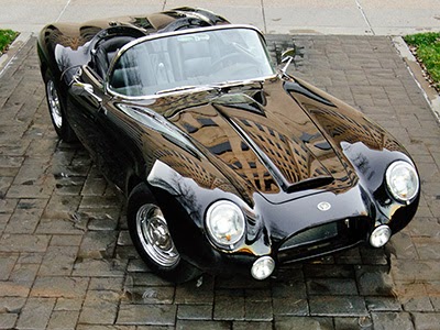
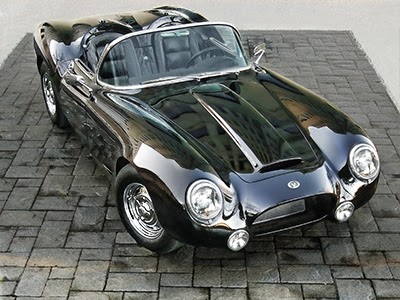
Let's take a look at some examples. This first image is of Brian Nielsen's Shelby, which I was fortunate enough to shoot recently. This is the way everyone shoots the wheels, and it's entirely appropriate for this car, in this location. The impression is that of a "beauty shot." You can see the wheel detail, which is important for a restoration, and the car looks like it has been posed for your pleasure. You can see (and feel) that there's been more effort put forth than just driving the car up in front of the camera.

Now let's take a look at a Johnny Martin build, the '62 Corvette called Elegance. Note that the wheel is pointed slightly toward the camera. I did this deliberately, to invoke the same feeling that a runway model does when she strikes a pose at the end of the runway. If you know any models, you know that they're normally supposed to point their leading foot toward the camera. That keeps their foot looking small, and gives them an elegant, sophisticated look. This car has a different kind of beauty than the Shelby. Indeed, since the car's name is Elegance, it requires that the shot look refined, much like a model. That attitude is assisted by the wheel. Picture the car as a model, with her foot pointed toward the camera, and it makes the idea much easier to understand.

In fact, that's one of the tricks I use during a shoot. I pretend the car is a human model on the runway, and that quickly tells me what kind of shots to use.

The third example wasn't shot by me. It was shot by Andrew Cooper of Paramount Pictures, who happens to know a little something about photography, and has a tremendous responsibility to his employer to portray characters in exactly the right way. If you check out his work through your favorite search engine, you'll see he does a lot of people. That sensibility helped him determine how to stage this shot of one of the Bumblebee Camaros from Transformers 4. The attitude needed for this car is the same as a race car - lots and lots of attitude, heavy breath, danger, and foreboding. Imagine yourself walking through the African Savanna, when you happen across a lion laying down. He sees you. You know you're in trouble. But the real trouble begins when, still looking at you, he puts one paw in front of his body, and starts to get up! This is the moment you know some very bad, very unavoidable things are about to happen. That's the same attitude portrayed by having the wheel turned back, the tire ready to come right at you. This angle shows that this car is not to be trifled with; that it can devour your soul at the slightest provocation.

Now picture the Camaro or the Corvette being posed in the same way as the Shelby Mustang. The attitudes portrayed would be completely lost if the wheels had been turned, and both shots would be ruined. Yet it's perfect for the Shelby.

Now let's look at one last angle. This is Ted Parks's wonderful handbuilt roadster, the Varsity. This rear angle displays a very different aesthetic from shooting from the front or side. For a shot like this, I will invariably turn the steering wheel to show the wheel detail, as shown. I haven't yet come across a circumstance where I would show the tire from this angle instead of the wheel. But that doesn't mean it can't be done, it only means I haven't yet come up with a way to use it!

So keeping all that in mind, don't be afraid to deliberately break any rule - your shots will be better for it!

Sunday, January 5, 2014

6 Secrets for Having Your Car Judged at an Indoor Show

There’s a lot to admire at a typical car show, and you want your entry to look at least as good as everyone else’s. And while there are many, many other tricks and tips to getting the best out of your car and the judging process, the below guidelines give you a great understanding of the basics of show judging. Some information for this section was provided by Eddie Potestio, an interior specialist for more than thirty years, and a respected judge in the Rocky Mountain Region for almost two decades.

1. Know the show rules! If you really want to place in the competition, you’ll need to know two items: First, ask the show organizer whether the judges are using the ISCA rulebook. This is the standard for most reputable competition shows other than concourse shows, which have multiple sets of rules for various classes. Those rulebooks and guidelines are too extensive to be listed here. Second, find out how the judges need your car displayed. For example, judges usually won’t open your hood if it’s closed, so if you want to show it off, open the hood, doors, and trunk.
Don’t worry about disturbing the clean lines of the car by having the hood open. That’s what the show card is for! Let Craig come up with one that is unique to your car. See some samples here

2. Leave your car open until the awards have been presented! The judges will come back to your car several times; first to decide what class it belongs in, then again to judge it, and perhaps two or three more times, to compare with other cars they’ve seen since they last peered into yours. A common mistake is to see the judges walk away from your car, assume they’re done, and close it all up. But when they come back, they can no longer see the engine work they were trying to compare to another car in your class, and that means you just lost the tie.
Let Craig help you with a show card display that lets people see the car in views they wouldn't normally see in the show itself. This can help you resist the temptation to keep changing the way your car looks during the show.

3. Clean farther than you can reach! Judges will inspect your work with a flashlight, and they’re trained to see dirt and inaccuracies that you might miss. That means you have to spend a great deal of time cleaning things that are difficult to see. Remember when you figured the lower firewall wouldn't be seen? The judges know in less than a second that you didn't clean it. Clean underneath, inside, and in between, not just the outside. Clean the entire distributor cap, all the fixtures around the engine bay, the carpeting up under the dash, all the way inside the wheelwells, the suspension, everything. If your car is driven, you’ll need to spend at least several hours cleaning it before the show. Don’t wait until show day to start this process.
Because it can take so much time to clean, Craig is happy to do the shoot for your car in-show, so you don’t have to go through the cleaning process more than necessary! Some of these examples were actually done in-show.

4. Carry a theme throughout the car! Classes are set up with very specific rules. If you put new wheels on your otherwise original AC Cobra, you’ve just lost your class. Once you make one change that will take you out of the stock categories, you may as well go all out with the mods, because you’re now competing with people who have done just that. In a restored class, having original equipment like a windshield won’t help your score if it looks less than brand new.
If you must have those wheels, put them on for a photoshoot, then put the originals back on for the show.

5. Don’t obscure the car with signs, pictures, or other memorabilia! The first thing a judge wonders when they see all the pictures laid out on the running board is “What are they hiding?” But they’re not going to remove your display to judge, either. So it will only hurt your score. Also, don’t make your display so complex, with dozens of trophies, plaques, excess machinery, or books that the judges will not want to get near the car. They don’t want to damage your car any more than you want them to, so they won’t take the chance. They’ll just stay ten feet away, and miss all the graphics you etched into the underside.
Craig can build a custom show card with a very sophisticated and polished look, and he can also give you guidance on an effective, unobtrusive display that can even include artwork based on your car.

6. Don’t make excuses – Learn something! A lot of owners and builders ask the judges later why they got the score they did. This is a necessary part of the show process, so don’t hesitate to talk to them afterwards. But… if a judge tells you about the sag in the fender paint he saw, don’t start in with the story of why you couldn’t get it just right. That simply indicates that you already knew about it, and were just hoping they wouldn’t see it. So why did you even ask, if you already knew the flaws? Instead, take that oppotrunity to realize that people will in fact see the things you hope they won’t, and you just need to work harder for the next show. It’s no big deal – every car has things wrong with it, even from the best builders in the world. Find the time to fix those things, and they’ll never be an issue again.
If your car has issues you can’t address, don’t worry. A photoshoot from Craig will address those concerns so that you won’t see those flaws in the final shots.

Competing for a trophy or other award is easy; winning is extremely difficult, and is a process that is best reserved for those who are willing to put in much more time than they originally thought would be necessary. Don’t be afraid of failure. Use that lesson to be better in the next show. Before you know it, you’ll be respected in the show community as someone who really knows what they’re doing.